- Why Is Autumn the Ideal Moment to Refresh Your Decor? – Autumn 2026 Colors
- Color #1: Chocolate Brown and Warm Caramel – Enduring Comfort
- Color #2: Forest Green and Moss – Nature's Breath Indoors
- Color #3: Greige (Grey-Beige) – The Timeless Neutral Base
- Tactile Texture Trends: Bouclé, Chunky Weaves, and Raw Timber
- Lighting as an Art Form – How Light Transforms Wall Color
- How to Embrace Autumn Trends Without Spending a Fortune
- FAQ – Frequently Asked Questions
- Which colors will dominate living rooms in autumn 2026?
- How can I add warm colors without painting walls?
- Can you combine Scandinavian style with warm autumn colors?
- How much does a no-renovation autumn interior refresh cost?
Why Is Autumn the Ideal Moment to Refresh Your Decor? – Autumn 2026 Colors
As daylight hours shorten and autumnal breezes herald crisper temperatures, our homes naturally become our primary sanctuary. It is during this transitional season that we spend more unhurried hours indoors, gathering with loved ones and savoring peaceful evenings with a hot mug of spiced tea. Autumn instinctively inspires us to envelop our spaces in warmth, cozy tactile layers, and soulful harmony. Refreshing interior decor for autumn 2026 is far more than following transient aesthetic fads; it is an intuitive act of self-care. Surrounding ourselves with reassuring earth tones, comforting textiles, and ambient lighting shapes our emotional equilibrium, nurturing optimism and serenity throughout the darker months of the year.
Transforming your living space does not necessitate an exhaustive, disruptive renovation. Often, thoughtful refinements – introducing a plush wool rug, styling accent cushions in warm seasonal hues, rearranging lounge seating, or incorporating mood lighting – suffice to infuse the entire home with fresh vitality and seasonal magic. Autumn offers an inspiring invitation to experiment with rich, organic textures that ground the senses. By welcoming tactile bouclé, nubby knits, and hand-rubbed timber grains, we curate an environment that invites true relaxation.
Autumn also serves as a gentle seasonal bridge connecting the sunlit vitality of summer to the quiet introspection of winter. Our interiors should mirror this shift, weaving continuity between the seasons. Welcoming natural elements such as unvarnished wood, stone, and slubbed linens preserves an organic connection to the outdoors, even when inclement weather keeps us fireside. Ambient illumination is equally decisive: soft, layered illumination calms the mind after a demanding day. As landscape palettes outside deepen into rich russet tones, echoing them indoors aligns our homes with nature's rhythmic cadence.
A seasonal decor transition also presents an ideal opportunity to declutter and edit away possessions that no longer serve us. Mindful simplicity and tailored order are increasingly celebrated in modern living, and early autumn is the perfect moment to embrace them. Clearing excess visual clutter opens up space, airflow, and mental clarity. An intentional, harmonious living space directly supports emotional wellbeing, turning your home into a restorative personal retreat.
Environmental psychologists frequently highlight the human „nesting instinct,” which surges as temperatures drop. We instinctively seek to prepare our immediate environment for the colder months, drawn to furnishings that convey longevity, warmth, and provenance. That is why autumn is when design enthusiasts seek inspiration to introduce changes that endure. Take time to listen to your intuitive spatial needs: if your lounge armchair craves the warm glow of a reading lamp, make that adjustment today.
Color #1: Chocolate Brown and Warm Caramel – Enduring Comfort
Leading the autumn 2026 interior trends is deep chocolate brown – an opulent, grounded shade of exceptional refinement. It evokes quiet luxury while connecting intimately with the warm earth. Paired with buttery caramel, it forms an immaculate autumnal duo: balanced, cocooning, and timeless. Welcoming these tones into your living room instills immediate stability and composure. Chocolate brown excels across statement painted surfaces, rich upholstery, and handcrafted ceramics alike, offering a fresh, contemporary nod to mid-century modernism.
Warm caramel introduces gentle sweetness and optimistic light. It captures the golden afternoon sun, candlelight, and glowing hearth embers. Caramel accents revive understated interiors, injecting effortless warmth. Layering caramel with tactile natural fibers – raw timber, nubby linen, and slubbed cotton – magnifies organic comfort. Whether within classic, contemporary, or warm bohemian decor, settling into a caramel leather armchair or wrapping oneself in a caramel wool throw provides an immediate sanctuary of calm.
When incorporating chocolate brown and caramel, mindful balance is key. Excessive dark brown can occasionally feel heavy; counterbalance it with crisp off-white, oatmeals, or warm greige to maintain luminous equilibrium. Intertwining varied textures – chocolate velvet pillows, caramel saddle leather, and gauzy drapery – yields tactile depth that elevates everyday living.
These tones also harmonize effortlessly with companion autumnal accents. Pair them with forest green, burnt terracotta, or golden mustard for vibrant energy, or balance them alongside quiet charcoal and stone neutrals for Scandinavian restraint. Whichever palette you curate, these grounded earth tones cultivate spaces that feel deeply authentic and personal.
Chocolate brown and caramel also carry an air of longevity. Investing in seating and casework within this palette ensures pieces that remain stylish for years, championing mindful sustainability over fast-furniture disposable trends. A deep oak coffee table paired with caramel upholstery creates an inviting gathering hub that naturally disguises everyday wear in active family homes.
Color #2: Forest Green and Moss – Nature's Breath Indoors
While autumn foliage transforms into vibrant fiery reds and ambers, deep botanical green remains an enduring anchor that bridges the memory of summer with the anticipation of spring. In autumn 2026, deep forest green and velvety moss green take center stage. These verdant tones introduce tranquility, organic balance, and fresh vitality into living spaces, calming the senses and fostering restorative rest.
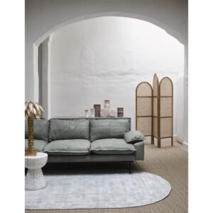
Forest green brings mystery, poise, and architectural depth, flourishing in living rooms, master bedrooms, and home libraries. Accented by warm brass hardware, natural timber, and warm amber illumination, it composes a dignified atmosphere. Moss green, with its muted greige undertones, is a versatile neutral that complements soft pastels and off-whites. Deep jewel-toned greens absorb ambient glare, making them ideal anchors for accent walls.
Greenery extends beyond painted surfaces and upholstery into living house plants that purify indoor air and nurture emotional wellbeing. Potted ferns, fiddle-leaf figs, and trailing pothos harmonize effortlessly with slubbed linen, woven rattan, and ceramic planters, bringing a breath of life indoors during shorter daylight months.
Whether you paint an entire library in emerald green or introduce emerald velvet cushions, moss-toned drapery, and artisanal glazed ceramics, green delivers creative flexibility. It allows subtle seasonal updates while keeping your decor deeply attuned to nature.
Botanical green also provides proven therapeutic benefits. In a screen-dominated, overstimulated world, resting your gaze on forest tones slows heart rates and lowers blood pressure. Paired with the expressive grain of European oak or American walnut, green brings the peace of the forest directly into modern urban apartments.
Color #3: Greige (Grey-Beige) – The Timeless Neutral Base
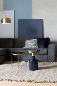
In contemporary interior design, greige – the harmonious fusion of crisp grey and warm beige – continues to reign as the quintessential foundational neutral. It marries the architectural clarity of grey with the cozy warmth of beige, avoiding both clinical sterility and dated yellow undertones. Greige serves as an ideal canvas for autumnal palettes, supporting deep chocolate browns, jewel greens, and rich metallics with graceful poise.
A paramount virtue of greige is its chameleonic response to varying light. Under cool morning daylight it reads crisp and airy; beneath warm evening filament illumination it radiates golden warmth. This dynamic shift ensures interiors feel engaging throughout the day, creating an intimate, cinematic atmosphere in lounges and bedrooms alike.
Selecting greige as your foundational wall tone grants total styling freedom. You can effortlessly layer vibrant autumnal accents – plum, midnight navy, or amber – or keep the composition tranquil with creamy off-whites, textured linen, and pale white-oiled floorboards.
Greige also visually expands square footage. Its balanced reflectivity bounces ambient light into darker corners, making compact city apartments feel open and serene. If you admire the refined serenity of Nordic master suites, greige is the definitive foundational choice.
The enduring brilliance of greige lies in its bridge between the cool minimal grey palettes of the 2010s and today's resurgence of warm, organic living. It provides a peaceful sanctuary for those hesitant about bold wall colors. Against a greige backdrop, contemporary Scandinavian style and Warm Nordic aesthetics flourish, allowing seasonal shifts simply by swapping light summer linens for rich autumn velvets.
Tactile Texture Trends: Bouclé, Chunky Weaves, and Raw Timber
Autumn awakens our desire for tactile warmth and physical comfort. In 2026 design, this manifests in the widespread celebration of expressive textures. Bouclé – with its signature looped, knotted surface – epitomizes casual elegance. Bouclé accent chairs, ottomans, and tactile cushions add inviting warmth and sculptural poise, offering physical solace during chilly autumn evenings.
Chunky knit throws and textured wool plaids offer comforting rusticity. Draped across a sofa corner, a heavy cable-knit blanket invites curling up with a book. Mixing diverse weaves – ribbed corduroy, nubby wools, and fine stonewashed linens – prevents monochromatic palettes from falling flat.
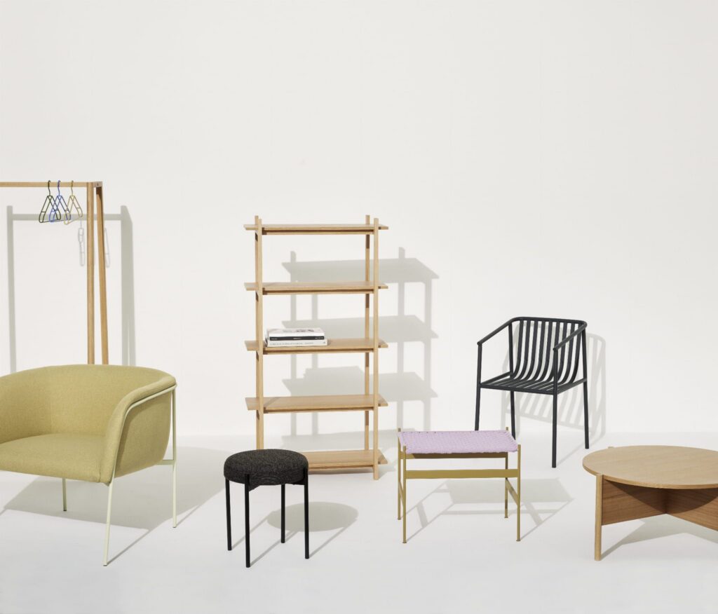
Raw, tactile timber with visible knots, brushed grain, and organic edges anchors autumn living spaces. Reclaimed oak console tables, walnut chopping boards, and live-edge accent pieces introduce authentic grounding energy that contrasts beautifully against soft upholstery.
Tactile layering also absorbs domestic sound. Knitted textiles, plush drapery, and textured wall coverings dampen reverberation in high-ceilinged modern open-plan layouts, creating an intimate acoustic cocoon.
These tactile surfaces also interact gorgeously with low autumn light. Angled raking light across nubby bouclé and wire-brushed timber yields gentle shadows, giving rooms artistic depth and visual intrigue.
Lighting as an Art Form – How Light Transforms Wall Color
Illumination is far more than functional necessity; it is the emotional soul of an interior. In autumn, when natural sunlight wanes, artificial lighting dictates how we perceive space, materiality, and mood. The most lavish palette can feel flat beneath harsh, unconsidered downlights.
Color temperature is paramount. Autumn calls for warm white light (2700K or 2200K) that mimics sunset and candlelight. Warm lumens accentuate chocolate and caramel tones, softening deep greens and bathing greige walls in a soothing amber glow.
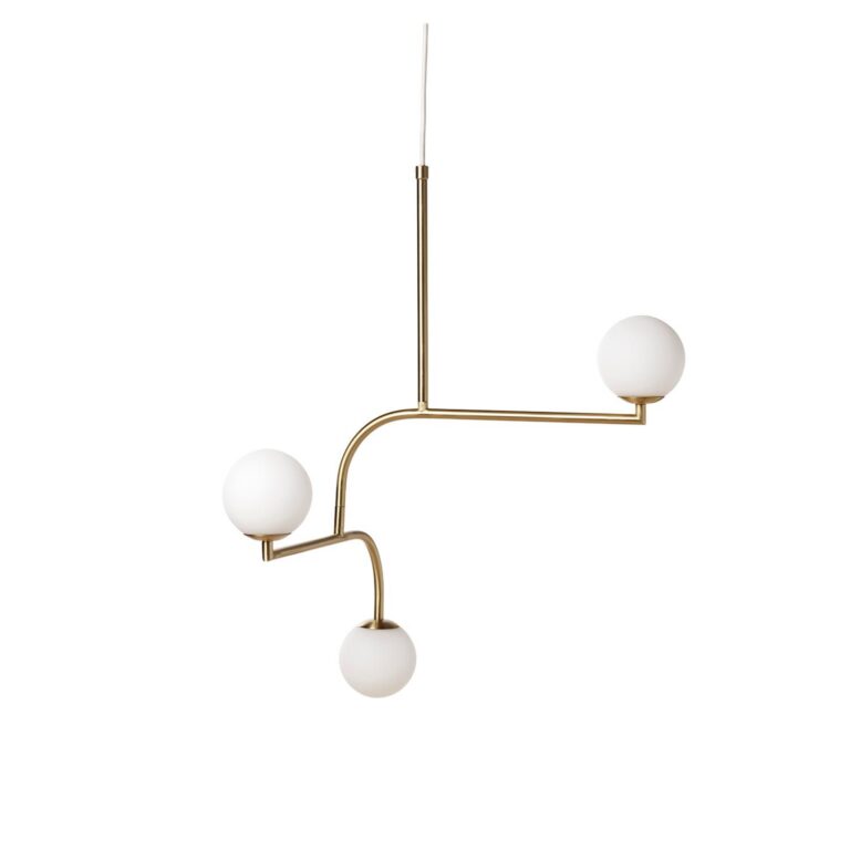
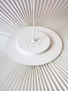
Layering multiple light sources across varying heights is essential. Rather than relying on a single overhead glare source, curate three to five discrete lighting points: a dimmable floor lamp beside the reading nook, a sculptural ceramic table lamp on the sideboard, and low-hung bedside pendants.
Selected furniture and lighting for this interior
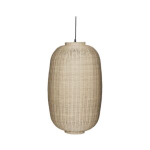
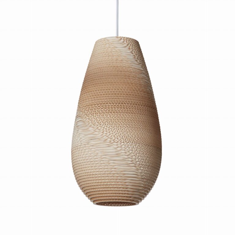
Chand L natural rattan Hubsch hanging lamp
Hanging lamp with a hand-made rattan lampshade in a natural color. Lamp...
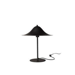 Pholc
Hans 40 black Pholc table lamp
The table lamp from the Hans collection, the renowned Swedish brand Pholc, is an example of minimalist...
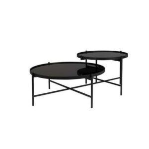
STOLIK KAWOWY LI
Table tops with black tempered mirrorPowder coated iron frameSuitable...
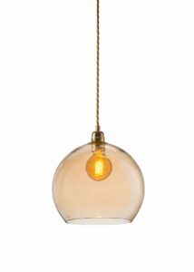 EBB & FLOW
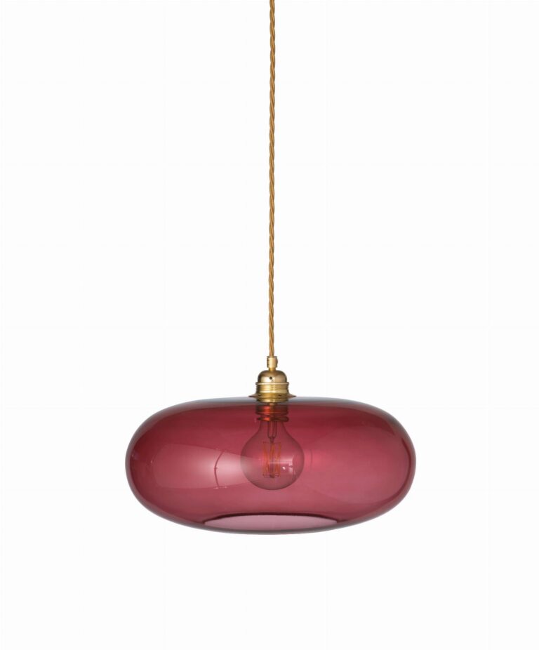
Rowan hanging lamp Ø28cm golden smoke - Ebb&Flow
diameter 28cm height = 28cm
Explore dimmable LED fixtures and warm-dimming bulbs that recreate the nostalgic warmth of incandescent filament lamps, allowing fluid transitions from daytime energy to evening retreat.
Light also sculpts architecture. Upward-directed wall sconces visually elevate low ceilings, while narrow accent beams highlight artwork and textured brick. Directing multiple low-level pools of light allows you to direct the evening mood seamlessly.
How to Embrace Autumn Trends Without Spending a Fortune
Adopting fresh seasonal trends does not demand extensive expenditures or major renovations. Introducing autumn warmth can be accomplished easily, economically, and with great style. The key lies in moderation, curated editing, and creative reinterpretation of existing pieces.
Textiles represent the swiftest and most budget-conscious path to seasonal transformation. Swapping cushion covers for velvet in caramel or forest green, tossing a wool throw across the sofa, and hanging heavier drapery immediately shifts the room's character. Complement these with framed prints featuring warm abstract landscapes.
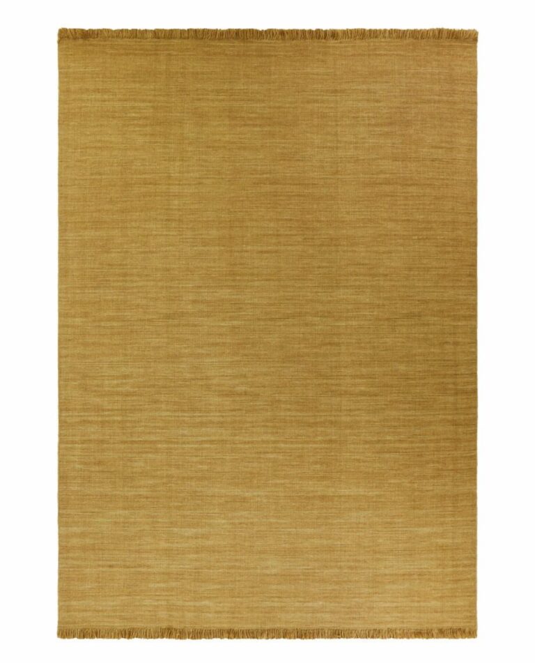
Living greenery is another accessible styling update. Incorporating hardy indoor plants brings vibrant organic energy indoors. On the floor, welcoming, cozy living room rugs tie the entire seating layout together, providing thermal insulation underfoot as temperatures fall outside.
Refining lighting costs very little: swapping harsh cool bulbs for 2700K warm filament LEDs or styling an artistic tabletop lamp instantly creates cozy evening ambiance. Editing away summer clutter and rearranging your seating closer to natural light or the fireplace breathes fresh life into existing layouts.
Embrace creative DIY updates as well: refreshing a picture frame in antique brass, styling ceramic vessels with gathered seasonal branches, or refinishing an occasional table. Small bespoke touches impart authentic character and artisanal soul into your home.
FAQ – Frequently Asked Questions
Which colors will dominate living rooms in autumn 2026?
Autumn 2026 living rooms will be characterized by warm, cocooning earth tones. Leading the way are rich chocolate brown and warm caramel, paired alongside forest green and moss tones. These rich hues are harmonized by versatile greige, creating a tranquil, sophisticated, and deeply welcoming seasonal sanctuary.
How can I add warm colors without painting walls?
You can easily infuse warmth through curated accessories. Introduce caramel and rust velvet cushion covers, drape a heavy wool throw over the sofa, and style with artisanal ceramics and framed art prints in warm tones. Switching to 2700K warm filament bulbs also casts a flattering golden wash over existing pale walls.
Can you combine Scandinavian style with warm autumn colors?
Absolutely! Contemporary Nordic design has evolved into the celebrated 'Warm Nordic' aesthetic. Sterile greys and bright whites are replaced by warm oatmeals, greige, caramel, and botanical greens. This pairing preserves clean lines and functional simplicity while adding soothing domestic warmth.
How much does a no-renovation autumn interior refresh cost?
A seasonal refresh can be remarkably economical. With a modest budget of 200 to 300 PLN, you can acquire several textured cushion covers, warm bulbs, and a cozy throw blanket. Investing 500 to 1,000 PLN allows adding a plush area rug and curated ceramics. Rearranging furniture and styling seasonal botanicals is entirely free, proving that great design is driven by creativity and taste rather than expense.
Where to buy similar furniture and accessories?
If you liked the above arrangement, we have selected the most popular furniture and accessories in this style. Check offers and compare prices directly on Ceneo:
Do you want to support our development?
We run this blog out of passion for beautiful interiors and good lighting. We do not publish sponsored articles and all opinions presented are 100% independent. If you want to support us, shop in our store bihome.pl or use our referral links when choosing add-ons. For you it's exactly the same cost, and for us it's a chance to create more articles in our free time. Thank you!